The 5 most common barriers to a website
and how to recognize and fix them
Last updated: May 2026
Designing a website to be accessible means optimizing many small components. Simply adjusting colors is not enough, even if it is a good first step. In order to adapt your Drupal website to comply with legal requirements, there are a few key components that must be taken into account – not only when making initial improvements, but also when maintaining new content in the future.
In this article, we give you an overview of the most common barriers that need to be improved.
But first, why should my website be accessible?
There are three good reasons. The first is legal compliance: since June 28, 2025, Germany's Accessibility Strengthening Act (BFSG) implements the EU European Accessibility Act (EAA) and requires accessibility in the digital space. The detailed requirements are explained in our article on accessible Drupal applications. To find out whether you are personally affected, see Does my website have to be accessible?
Beyond the legal requirement, there are further benefits:
- 94% of large e-commerce sites are not accessible (Baymard benchmark). You stand out from competitors when your shop is accessible.
- Better visibility in search engines. Many accessibility measures – semantic HTML, clean heading structure, ALT text, fast performance – directly improve rankings. Inclusion means broader reach, more users and customers, and higher revenue.
- Lower bounce and exit rates. Not only people with disabilities benefit from the optimization – all visitors win from clearer processes and structures, which raises conversion and revenue.
The five barriers below are the ones we encounter most often in audits. They are aligned with the WCAG 2.2 criteria and the BFSG requirements. To make a site accessible, both technical and design aspects need a systematic approach.
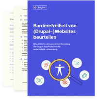
Kostenlose Checkliste
Unsere kostenlose Checkliste hilft Ihnen, typische Barrieren auf Ihrer Website schnell zu identifizieren – als fundierte Grundlage für weitere Optimierungen.
The 5 most common barriers
Alt text for images and interactive elements
Poor or missing alt text is a major problem for people who use screen readers: content is not conveyed clearly, important functions remain unclear, and barriers arise where accessibility should be the norm. This is particularly critical for interactive elements such as icons, buttons, or links—if only “Icon.png” or nothing at all is stored there, no one knows what is behind it.
Good alt text, on the other hand, describes what is relevant in a meaningful and context-related way: For images with informational content, there should be a brief description of what can be seen and why it is important. For purely decorative images, on the other hand, no alt text is set (or an empty alt text so that screen readers skip them). For control elements, the alt text describes **the function**, not the appearance – i.e., “open menu,” “start search” instead of “magnifying glass” or “three lines.” This makes content understandable, usable, and truly inclusive.
Keyboard navigation of the website
If a website lacks functional keyboard navigation, important areas become simply inaccessible to many users—especially those who cannot use a mouse or who use screen readers.
Without a logical tab order, skippable areas, and clearly recognizable focus states, users lose their orientation, get “stuck” in elements, or cannot access central functions such as navigation, forms, or buttons.
Visible focus states are essential because they indicate where you are and which element is active. Adjustments to keyboard control make the page comprehensible, usable, and thus truly accessible—not only technically, but also practically in everyday life.
Color contrasts in text and elements
Sufficient color contrasts in text, controls, and important content are crucial for accessibility, as many people with visual impairments, color blindness, or age-related limitations can hardly recognize certain content, if at all.
If contrasts are too low, text blends into the background, buttons are overlooked, and information is lost—even with good design.
Good contrasts ensure that information is clearly perceptible, regardless of visual acuity, display quality, or ambient light. This significantly improves overall orientation, readability, and usability, making the website more inclusive and usable for everyone.
Viele dieser Barrieren stehen in direktem Zusammenhang mit den Anforderungen der WCAG 2.2 sowie dem Barrierefreiheitsstärkungsgesetz (BFSG). Wer seine Website barrierefrei machen möchte, sollte daher sowohl technische als auch gestalterische Aspekte systematisch prüfen und priorisieren.
Blogartikel: Muss meine Website barrierefrei sein?
Accessible forms and error handling
Accessible forms are crucial to ensure that all users can understand and submit their entries correctly.
Common problems arise when fields are not clearly labeled, error messages are incomprehensible or only displayed visually, or when information such as mandatory fields is missing.
Good error handling clearly shows which field is affected, explains the error in an understandable way, and provides immediate feedback—ideally both visually and for screen readers.
Labels should be clear, logically positioned, and linked to the input fields; placeholder text alone is not sufficient. This makes forms intuitive to use, reduces frustration, and ensures that all users can interact successfully.
Website structure with headlines and landmarks
A clear website structure with meaningful headlines (H1–H6) and landmarks (e.g., <header>, <nav>, <main>, and <footer>) significantly improves accessibility, as screen reader users can grasp content more quickly and navigate in a targeted manner.
Headlines structure text logically, while landmarks provide orientation on the page and enable users to navigate directly to areas such as navigation, main content, or side columns.
Common problems arise when headings are skipped, incorrectly nested, or used purely for decorative purposes. This makes the page confusing for people using assistive technologies and makes important content difficult or impossible to access.
A clean, semantic structure therefore makes websites more understandable, efficient, usable, and significantly more inclusive.
Kostenlose Checkliste
Ist Ihre Website bereit für digitale Barrierefreiheit?
Mit unserer kostenlosen PDF-Checkliste erhalten Sie einen ersten strukturierten Überblick über Handlungsbedarf und Prioritäten. Für alles Weitere stehen wir Ihnen als spezialisierter Partner für digitale Barrierefreiheit zur Seite.
How do I get started?
A structured start is decisive. Our free accessibility checklist helps you identify and prioritize the most important issues on your site. For a thorough baseline assessment, we recommend our accessibility audit.
In our article How can I make my website accessible? we explain a 5-step process to design, adapt and continuously maintain your Drupal site for accessibility – so you stay legally compliant and reach new users and customers.
As a specialized Drupal agency we support you in the actual implementation – from accessible UX design through front-end adjustments to WCAG-compliant code. Reach out if you need an accessibility audit for your Drupal site.
You may also be interested in


Do you want to develop sustainable digital projects?