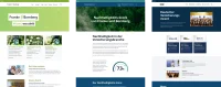
Franke & Bornberg
Multibrand-Designsystem with Drupal and Figma

Overview
Franke und Bornberg, a leading insurance rating agency, has stood for independent analyses and transparent assessments for 30 years. With its established ratings, numerous media cooperations, including Handelsblatt, Focus Money, n-tv and awards such as the German Insurance Award and the Sustainability Score, the company sets standards in the industry.
As part of the project, a scalable multibrand-designsystem was developed that combines the corporate identities of all brands. This system is based on the Atomic Design Model and uses a token system for colors, fonts and other design elements.
Client
Franke & Bornberg GmbH
Period
since 2024
Websites
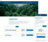
www.franke-bornberg.de
www.nachhaltigkeits-score.de
www.vers-award.de
Our services
- Consulting
- UI/UX design
- Responsive design
- Design system
- Wingsuit Library
- Drupal development
Technologies
- Drupal 10
- Wingsuit
- Style Dictionary
- Tailwind CSS
- Storybook
- Tokens Studio
- Figma
Initial situation
Franke & Bornberg wanted to create a future-proof design system that would serve multiple brands consistently and efficiently. The goal was a system that unites the corporate identities of the main brand and sub-brands - without compromising on flexibility and recognizability.
Core requirements
Scalable Multibrand-System
- Centralized maintenance of styles
- Consistent UI across all platforms
- Tight integration of design and code
Drupal serves as the technical foundation, as its flexible template and theme structure provided an optimal basis for the design system.
The solution
Design system according to Atomic Design
The entire UI was built modularly according to Atomic Design:
Atoms: e.g. colors, icons, buttons
Molecules: combinations such as cards, search fields
Organisms: more complex components (headers etc.)
Templates & Pages: ayout and content structure
Figma Variables and Tokens Studio enable the centralized management and reuse of all design elements.
Centralized design tokens
- Color, typography and spacing tokens created in Tokens Studio
- Export to JSON format for use in code
- Automated conversion to CSS variables via style dictionary
- Synchronization with Figma & Storybook
The result: full visual control, less redundancy and flexible theming per brand.
Implementation in Drupal
Implementation in Drupal 10 with Tailwind CSS & Wingsuit
- Components were dynamically integrated into Drupal
- Storybook served as a “single source of truth” for developers
Advantages for multi-brand web structures
Reduced maintenance effort: One central token set for all brands
- Increased efficiency: Fast theme changes, no redundant components
- Consistency in design & code: Uniform tokens in Figma and frontend
- Better documentation: Storybook as a living reference system
The collaboration with keytec is consistently professional, efficient and inspiring. Together we have realized several websites, where we have not only received excellent technical support, but also valuable input.
We would particularly like to emphasize the comprehensive advice: the service provider drew our attention to important issues that went beyond mere implementation.

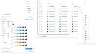
Overview of the token-based design workflow in the FUB Multibrand system: Central maintenance of design tokens in Tokens Studio, seamless transfer to Figma and as JSON for developers. The tokens flow into component-based UI design, are documented in the storybook and processed into accessible, dynamic pages in Drupal.
Modular design system with Atomic Design
Atomic Design is a structured approach to UI design in which interfaces consist of tiny, reusable building blocks. These are divided into five levels:
Atoms (e.g. colors, buttons), Molecules (e.g. search field with button), Organisms (e.g. headers), Templates (layouts) and Pages (pages with content).
Advantages: high reusability, consistent user experience and easy scalability. Design tokens create efficient, cross-brand design systems.
Example: Card component
The card is a typical molecule consisting of several atoms:
Image (Atom): e.g. product or article image
Text area (Molekül): Headline, description, category or icon if applicable
Button (Atom): Call-to-action such as “Learn more”
Such components can be used flexibly - for example on landing pages, in teasers or within templates - and can be adapted to the specific brand. Atomic Design reduces redundancies and optimizes the maintenance of the design system.
Flexible multi-brand design with theming diversity
Thanks to central design tokens and flexible modes, a single component can be used in different contexts in a visually consistent, brand-compliant and easy-to-maintain manner.
The following graphic shows the versatility of a token-based multi-brand design system using three card variants. Despite their identical structure, they differ visually through brand-specific designs and modes such as light, dark or highlight.
Card 1: Light Mode – classic and neutral; Card 2: Highlight Mode – eye-catching and ideal for promotions; Card 3: Dark Mode – modern and brand-specific for another brand
What are design tokens and how do they work?
Design tokens are the smallest, reusable unit in a design system. They define central design properties such as colors, fonts, spacing, shadows and sizes. Instead of maintaining these values manually in design or code files, they are stored centrally as structured variables - e.g. in JSON form.
A typical token could look like this: primary-color: #0055FF
This value is used system-wide - for example in Figma, CSS or frameworks such as Drupal. Changes to a token automatically affect all linked elements. This keeps design and code consistent, efficient and scalable.
Multibrand design with token logic
For Franke & Bornberg, we developed a token structure that leaves room for creativity, is maintainable and can be easily expanded for other brands.
Primitive tokens store raw values (e.g. primary.700).
Semantic Tokens abstract these (e.g. primary).
Component Tokens assign semantic tokens to UI elements such as buttons.
This structure enables flexible, cross-brand design systems with clear scaling and an efficient workflow.
Tokens in the Tokens Studio plugin (left) and in Figma variables and styles (right):
We greatly appreciate the partnership-based and always friendly communication, the high level of expertise and the solution-oriented work and look forward to further joint projects.
Conclusion: Successful multi-brand system with Drupal
The project is an example of how well thought-out design systems can be realized with a token-based approach and modern tools such as Figma, Storybook and Drupal - scalable, maintainable and consistent across brands.
Contact & Consulting
Are you planning a multi-brand design system or would you like to consolidate your Drupal websites?

More Drupal references


Do you want to develop sustainable digital projects?